Unite three abstract corporate pillars within one immediate, memorable motion idea on a four-week schedule.
Brand Design Lead · Hong Kong
06 / Henderson Land Group
Henderson Land 50th Anniversary
2026
Creative Direction · Motion Concept
Project in brief
Turning three anniversary values into one motion metaphor.
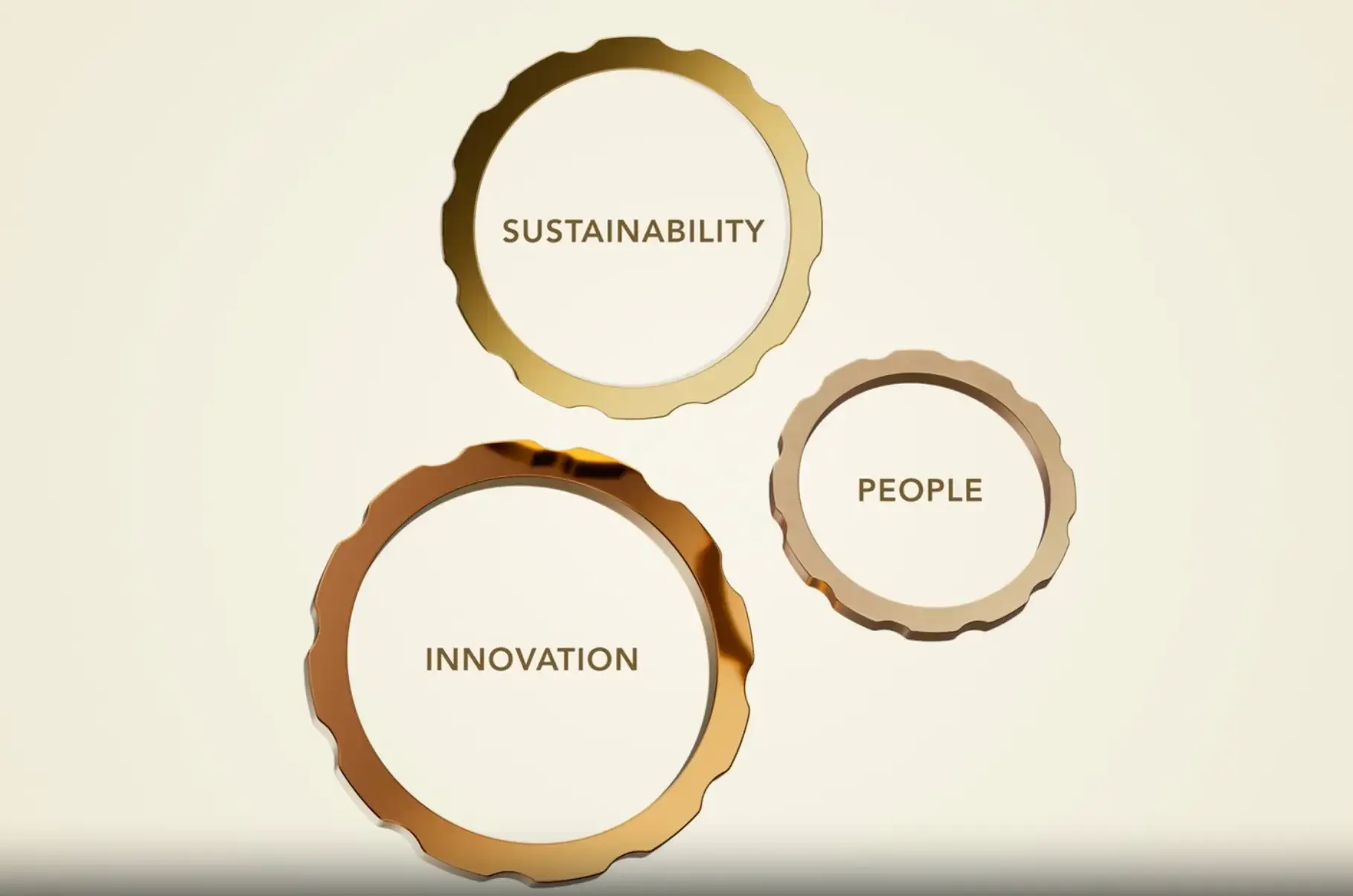
A motion concept that turns Sustainability, Innovation and People into three interlocking rings resolving as Henderson Land’s anniversary “50”.
Developed the central metaphor, motion logic and modular visual system, then directed material, pacing, composition and brand review.
Three Values, One Story
Henderson Land’s 50th anniversary needed to connect three corporate pillars—Sustainability, Innovation and People—within one recognisable motion idea.
The four-week schedule demanded a concept that was simple enough to read immediately and flexible enough to carry a complete anniversary sequence.
Sketch and construction logic resolving the rings into “50”.
The Visual Metaphor
I developed three interlocking rings, one for each pillar. They separate, rotate and reconnect before resolving into the commemorative “50”, turning abstract values into a story of connection, continuity and forward movement.
Gold-toned surfaces, controlled light and measured camera behaviour balance institutional heritage with a more future-facing expression.
My role covered the central metaphor, ring behaviour, modular graphic logic, material direction, pacing, composition and final brand review.
Hybrid Production Path
A hybrid workflow accelerated exploration without handing over the creative decision-making. Sketches and wireframes first established the movement; generative image tools then tested form, material and lighting; motion tools helped evaluate transitions.
I reviewed the results against the concept and brand system, refined colour and pacing, and removed directions that weakened the final “50” resolution.
The tools shortened iteration time. The metaphor, selection and quality decisions remained human-led.
Mechanics storyboard for ring rotation, separation and reconnection.
Ring-form and metallic-material exploration.
Animated ring transition and anniversary-form test.
Final anniversary installation / photographed application.
Result
The final system compresses three messages into one memorable action. It demonstrates how a clear visual metaphor can carry corporate meaning while remaining suitable for motion, stills and anniversary applications.
The project also shows where generative exploration is useful: expanding the option space quickly, then returning control to art direction and brand judgment.